Sunday 26 September 2010

9/10 Chosen Images.


Lucy Vigrass. 'Get Involved' poster.

Lucy Vigrass is another illustrator thats part of the 'Peepshow' collective. I thought the typography on this poster was really creative and fun on the eyes. And it's an element of my work that I'd like to be better at.

It's really similar an Ian Dury song book cover by Barney Bubbles, which also used a type face made from mechanical objects.


Tuesday 21 September 2010

8/10 Chosen Images.


'Where's Wally?'
I know that 'Where's Wally?' isn't particularly exciting or ground-breaking from an artistic point of view, but it definitely deserves appreciation every now and then. It doesn't matter what age you are, it always draws you in. The level of colour and detail is pretty incredible, which makes it a joy to look at.

7/10 Chosen Images.

'Capture'. Dryden Goodwin.

I'm a big fan of Dryden Goodwin's work, his series of images involving strangers are particularly interesting. He aims to break the boundaries that are built between strangers, in a way that would seem invasive. It's normal to pass hundreds of strangers with out motivation to get to know them. It's acceptable for many reasons, fear of the unknown could be a factor.


Making marks on the face in white emphasizes the contors and shape. This could be seen as an act of affection, highlighting our individualism. But I think if I placed myself in the position of the subject I might feel my privacy being invaded.

Monday 20 September 2010

6/10 Chosen Images.


'A Clockwork Orange' cover. Veronique Rolland.
I recently attempted to read 'A Clockwork Orange', then surrendered after 10 pages. But I did become attached to the cover, even though I failed to read the text. Having been familiar with film I feel I'm just qualified enough to discuss the meaning behind the image.
I think the decision not to use an image of the main character is an interesting one, as thats what is predominately used for the film and the different editions of the book. I like how just a simple, sterile image is used, representing the cleansing of the character's mind. By knowing the story, it feels like the madness is hidden.

5/10 Chosen Images.


Stephen Walter, 'The Island'.
One my favourite exhibitions of the last year was Magnificent Maps at the Birtish Library. The exhibition was a reflection of how people have recorded land and space differently over time. Showing how the purpose of maps reached much further than just navigation. What interests me most about maps is the combination of art and science, especially within ancient maps, representing both the geography and social aspects of the period.
I wanted to include Stephen Walter's 'The Island' because its an example of a map that exceeds the purpose thats been associated with modern maps. The scale of this map is mind-blowing. To see the detail in the exhibition it had to be magnified a small section at a time. But the scale is only a part of why this piece is unique. The map shows the characteristics of each area in greater London, using the format to represent the social aspects. Which reminded me of older maps that were often very subjective. But now they are mostly seen as a functional object. Maps are great.

4/10 Chosen Images.

SW11 Literary Festival Poster.

I found this poster recently in a magazine, unfortunately I don't know the designer.
It's not a particularly unusual image, but I like how the power station and book shelves have been positioned together. It makes Battersea appear vibrant, even though it doesn't reflect the real appearence. But there's actually many interesting events ongoing in Battersea and I like how the image expresses it.

3/10 Chosen Images.


'The House of Fairy Tales Passport' by Andrew Rae.

Andrew Rae is part of 'Peepshow', a collection of illustrators and animators based in East London. I like his work because it's both funny and intelligent. I think making other people laugh is a great skill to have.

This is image is a recent piece I found on Andrew's blog. I like how he manages to combine the fun and imagination of fairy tales with such an offical object. Particularly because he replaced all the existing images. A passport is such an important document, it's probably been a troubling subject for many people. Which is why I think it has an element of brutal humour even if it's not intentional.

2/10 Chosen Images.


Brandon Schaefer- 'The Dark Knight' film poster.
The way that film visually represents itself is very important. It's essential for the audience as it's likely to be the first piece of information seen before viewing the film. So it should be communicating all the key aspects, establishling the tone and interesting potential viewers.
Brandon Schaefer does this with his work, except he just focuses on how complex films can be reduced down to one bold image. For example with 'The Dark Knight', a film with such a large amount of visual history; cartoon, comics, it could be difficult to describe in one simple poster. But I think Brandon Schaefer manages to do it well.

1/10 Chosen Images.


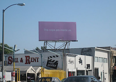
'The Cops Are Inside Us', Mike Mills.

It was when watching the art documentary 'Beautiful Losers', that I first became familiar with his work and how inspirational the street/skate culture was to so many artists at the time. The movement was motivated from the subcultures of the day (skateboarding, graffiti, punk), gaining the attitude to 'do it yourself.'

I chose this particular image because it shows how the spirit of the skate culture is clearly a part of the motive of Mike Mills's work, but the aesthetics and form seem to have matured. The element of rebellion and communication that sprung from graffiti/youth culture is still active, conveying a message to everyone that happens to pass. Much like the original street graffiti, 'the cops are inside us' is an antagonizing, possibly 'anticonformist' message, aiming to briefly take the viewer away from daily life and ponder the meaning and link to their own life. The only difference is that the writing is typed and on a billboard, which could make it seem more official, or from a reliable source. Which could raise the questions: if a message is graffitied by hand is it likely to have the same first impression? And is it easier to change things if you're part of an authority?